 |
| The NHL Stadium Series Sweaters |
So what does Gary Bettman do in his infinite wisdom?


Adds a slate of additional outdoor games all over this fine nation that are somewhat unnecessary and serves to water down the main event. But hey, think about the merchandising opportunities! And thus the Stadium Series was born.
So, with games being held at such iconic baseball venues as Dodger Stadium, Wrigley Field and Yankee Stadium, the NHL (and it's Reebok overlords) decided to outfit the teams with special uniforms for the occasion. And rather than go the fauxback/throwback route that the league has taken thus far with the Winter Classic, the official uniform supplier and the league (and you'd better believe it was in that order) introduced a new uniform template and numbering style for the Stadium Series that includes design features including:
- Diagonally placed sleeve numbers
- Elongated numbers on the back
- Contrasting shoulder yokes
- Chromed versions of team crests
- Truncated sleeve striping
And yes, that is indeed the hot mess that is sound like it should be. When you also factor in that two of the teams playing are members of the Original Six and normally wear some of the most traditional looking uniforms in the league, the introduction of a one-time new look is even more absurd.
So, with out further ado, may I present to you my ranking of the seven NHL Stadium Series sweaters:
7. Anaheim (Orange County) Ducks

The lack of the use of orange was frustrating to many. This was addressed only slightly with the introduction of a new alternate sweater in the 2010 season which included orange accented side panels and the secondary logo as the crest. Yet, this set was still primarily black and borrowed the same template as the much lambasted Islanders alternate sweater.
When the Stadium Series was announced, there was hope that the Ducks would introduce a new uniform with an orange based sweater. It was a chance to be bold and perhaps include a new color such as dark green, in keeping with an actual "duck" theme.
Sadly, this is what they produced. And it is garish. Whereas the Flyers have owned the color orange over the years and have made it work as a base color, the Ducks overdid it here, most notable with the lack of accent colors and minimal hem striping. And the completely orange socks don't help the look at all. And one of the shortcomings of the new sweater template really stands out here. Where the stripes on the socks break up the all-orange look a bit, the truncated sleeve stripes fail to do the same.
And finally, in one more bit of failure, the new sweaters feature an "OC" patch on the left shoulder, as in "Orange County" as it is apparent the league is trying to fuel a budding rivalry between Los Angeles and its neighboring county to the south. Orange County has never been used as part of any Ducks branding in the past and it really comes off as a weak attempt to forcefully add tension here.
6. New York Islanders
 Let's face it, the Islanders' current uniform set is perfect for them. It hearkens back to their dynasty days of the early 80s. Sure, they've had their fair share of terrible uniforms over the years (see this, this and this), but one thing has pretty much remained the same over the years; they own the blue/orange combination (the Oilers gave it up for a few years before coming to their senses and bringing back their own dynasty era blue and orange combo).
Even when the Islanders went to the ill-fated Gorton's Fisherman look in 1995, they still managed to keep orange around, albeit while incorporating a much darker hue of blue. When the returned to a more traditional look in 1998, they retained the navy and orange scheme. In 2002, however, the Isles broke the mold once again and introduced an all-new alternate sweater that used orange as the main color. While the execution was somewhat debatable, it was a bold departure from their usual look, but used their normal color scheme.
Along with the rest of the league, the Isles received the Reebok Edge treatment in 2007, retaining the navy and orange color scheme, while sharing a new template with the Carolina Hurricanes that featured a white outline around the shoulder yoke. They also introduced TV numbers on the upper right chest which made for a bit of a aesthetic mess. Yet, one year later, they began to make amends and introduced a throwback alternate sweater that resembled the one's from their 80's heyday, including the traditional royal blue and orange scheme. The fan feedback for the alternate was so great that the Islanders adopted the throwback look as their home sweater in 2010, incorporating a road version of the throwback as well.
But, the Islanders being the Islanders, they couldn't leave well enough alone. Without a doubt motivated by additional merchandising profits, they introduced an all-new alternate sweater in 2011 that used the same template as the Ducks' new alternate, while adopting a color palate that was very similar to their baseball brethren, the New York Mets. This new sweater ditched the regular logo and used and radially arched "Islanders" wordmark above the uniform number where the crest would normally be placed on the chest. A new serif font was used for the nameplate on the back as well. This new alternate look was universally lampooned by hockey fans and the uniform design community.
Which brings us to the Islanders' Stadium Series look.
At first glance, it's not bad. Royal blue is the main color and the orange and white stripes reminiscent of the normal home sweater are there as well. White is used for the the shoulders, which is fine. My main grip is the crest. I love the "NY" taken from the normal crest, but rendering it in a chrome look ruins what should be a great alternate logo. Furthermore, the lack of orange trim against the blue background is a huge missed opportunity to make that logo really pop. Additional demerits are given for the use of a Flyers-like contrasting nameplate (blue lettering on a white background) that looks completely out of place here.
On the whole, it's not a bad alternate look for the Isles, but the small details that could have made this uniform so much better justifies my somewhat low ranking for this uniform.
5. New York Rangers
 We all know the Rangers uniforms. They're ingrained in our hockey minds. They have a great look, especially given they're an Original Six team that really hasn't altered their look in 80 something years (the disco-era Winnipeg knockoffs excepted). Home or away, "RANGERS" spelled out diagonally across the front, shadow lettering and numbering, vertically arched nameplates, you know the Blueshirts when you see them.
Yes, they got swept up in the alternate uniform craze of the late 90's like a good number of teams. And yes, they went outside the box a bit, introducing both home and away versions of what was dubbed the "Lady Liberty" set, featuring a stylized version of the Statue of Liberty's head as the main crest and a modernized version of the Rangers logo as a shoulder patch. It also introduced gray to their color scheme.
Though the look was somewhat of a departure from their normal look, using navy instead of the more royal blue, it worked. And if anything, it strengthened their hold on being New York City's team. It was a solid take on an alternate uniform in an era when a good number of teams lost their minds.
The Rangers have introduced a couple of alternate uniforms since then. In conjunction with their 85th anniversary, they introduced a fauxback navy "Heritage" sweater with "New York" rendered in a simple sans-serif font on the chest and along with a new striping pattern on the hem and sleeves. Vintage white was used in place of white and the nameplates were radially arched done. In my book, it's easily one of the top 5 looks in the league right now.
They also introduced a brand new look for the 2012 Winter Classic when they played the Flyers in Philly. While it was an unmistakably a Rangers-like look, it was almost too simple looking and utilized a fauxback type chest logo that was rather uninspired. Juxtaposed to the heritage sweater, it paled in comparison.
To be honest, when the Rangers unveiled the Stadium Series look, I was prepared to be let down. By the time the team showed the look on their website, the new Reebok template had been made public for quite some time and it was really just a matter of figuring out how they would color in the different panels and what logo would be used.
Much like the Islanders, it's not bad. At first glance, there's no question it's the Rangers you're looking at. The diagonal sleeve stripes are reminiscent of the striping pattern used on the white version of the Lady Liberty alternates. The single hem stripe looks rather skimpy as well. The blue shoulder yokes work for me, but like every other team using this template with contrasting colored yokes, the fact that color does not continue all along the back of the neckline (surely to help focus on the Reebok wordmark) is a major design flaw. I'm not a fan of the side striping. It's unnecessary.
My main complaint is with the wordmark on the chest. The chromed look just muddles what should be a very sharp "New York" in blue letters with red trim that pops against a white background.
Interestingly, the Rangers have never used "New York" in their traditional italicized font on their chest at home, save for one game - the first game played at Madison Square Garden after the tragedy of 9/11. In that game, the Rangers faced the Buffalo Sabres and both teams had "New York" on their chest in place of their normal insignias. The Rangers did have "New York" on their road (blue) sweaters from 1978-97.
In short, that Rangers' Stadium Series look is decent, but nothing that should have a Ranger fan looking to part with their money to purchase.
4. Pittsburgh Penguins
 Simply put, the current Penguins uniform set is ugly. There are a bunch of teams' uniforms that took a turn for the worse when Reebok took over the NHL's uniform contract in 2007, but up to that point, the Penguins look was probably the best they had ever worn. They used Vegas Gold, which differentiated them from the Bruins, who use the more traditional Athletic Gold. They used the "Skating Penguin" that was part of their original look. And they had a diagonal striping pattern that was somewhat simple, yet different from any other team in the league.
So Reebok did what they always do when they take over a leaguewide contract and ruined a good thing.
They now used a wavy striped template that was shared with the Ottawa Senators that the die-hard Pens fans hated. The problem was, with NHL poster boy Sidney Crosby on the roster, they were so many bandwagon fans buying the new merchandise that no amount of public outcry was going to get them to change their look.
With the Stadium Series uniforms, the Penguins have actually upgraded their look a bit. While they are not an Original Six franchise, they have been around long enough to have a firmly established history. And as such, they should have a more traditional look than newer expansion franchises. The Stadium Series sweaters, with the simple two-color black and gold stripes is much cleaner than their normal sweaters. The black shoulders look good, though I'm not completely sold on the gold stripe along the bottom of the shoulder yoke.
Because this sweater looks better than what they normally wear, I feel justified in ranking the Penguins #4 on my list.
3. Chicago Blackhawks
 Hockey fans who know me, know how much I love the Blackhawks' sweaters. The home and away are easily two of my absolute favorites. And Chicago's look hasn't really changed all that much since the mid 50s.
The Blackhawks are an Original Six franchise and as such, they should never, ever wear anything that incorporates modern design fads or trends. The have a timeless look and should keep it that way (now get off my lawn!).
All kidding aside, the Blackhawks have introduced a couple of throwbacks in recent years, both of which have been black. Now, using black as the main color for an alternate could be considered a modern design fad, except that black is not only one of the Blackhawks normal colors, but they also have the precedent of wearing black as their main sweater color dating back to 1927.
The first alternate they introduced, in 1996, was a recolor of their white home sweater. I loved it.I thought it was the perfect was to introduce a new sweater while remaining true to their look. They kept this sweater until 2007 when Reebok took over. No teams were allowed to have alternate sweaters in the 2007-8 season (thanks Reebok overlords), but the Hawks reintroduced the black alternate for the 2008 season.
In 2009, the Blackhawks played the Red Wings in the Winter Classic at Wrigley Field and accordingly, they introduced a new uniform for the game. That design was based heavily on the uniforms they wore back in the mid-30s. In fact, the Hawks would use the Winter Classic sweaters as their alternates for the following two seasons as well.
When I found out the Blackhawks were going to play a Stadium Series game I freaked a bit. And when I saw the new Reebok template, I freaked more. Needless to say, I was worried that Reebok and the NHL (because lets face it - they're the ones who ram this stuff down the teams' throats) would really screw up the Hawks' look.
Fortunately, they didn't.
It's not great, but it really resembles those late 90's alternates, as much as possible, which is a relief. Given how bad these could have been, they didn't do a bad job of adapting the Blackhawks look to the new template.
2. Los Angeles Kings
 The Kings are one of those teams that can get away with trying out a different design - to a point. Yes, they are a west coast team in a non-traditional market, but they've been around enough to have established a solid history. That Stanley Cup in 2012 doesn't hurt either.
The thing about the Kings is that they've had two major looks throughout their history: the purple (aka "Forum Blue") and gold era and the black and silver era.
The Kings started out as an expansion team with the purple and gold look because they were owned by Jack Kent Cooke who just so happened to also own the Los Angeles Lakers and liked the colors. But the team was sold and with the start of the Gretzky era in LA, so began the black and silver look.
Over time, however, the Kings would bring purple back into the mix, starting as an accent color with the infamous "Burger King" alternates in 1996 then as an accent on the home and aways in 1998. It was used as the basis for a new alternate sweater in 2002 and again as an accent color for a new home and away set in 2007.
Last year, however, marked the Kings' return to a simple black/silver/white color palate. And to be honest, they kinda own that look. So it is with good reason that they should try to work within those colors but at the same time try something new as well.
And voila, we get the Kings' Stadium Series uniforms.
This is the one time the chrome look works for the crest. A shiny crown? Yep - makes sense. And gray as the main color? Works perfectly with black and white as accent colors. The wide stripes of the hem and sleeves are reminiscent of the ones from the Gretzky era. The black shoulders compliment the stripes as well. The only negative I see is the inclusion of a new "LA" patch on the left shoulder.
Put simply, if the Kings held onto this sweater as an alternate for the rest of the season (and perhaps longer) it'd be a perfect fit.
1. New Jersey Devils
 |
| Courtesy of SBNation |
First, a disclaimer of sorts: As of this writing, the Devils have not officially released their uniform for the Stadium Series game against the Rangers at Yankee Stadium. That said, a number of leaks and reports, including the picture of the advertisement for the NHL league shop at the top of this post have indicated that the Devils will be wearing the sweater shown above.
That said, God bless Lou Lamoriello.
The Devils' longtime General Manager and President has steadfastly held to the belief that the Devils, despite their relatively short history, will never bow to marketing fads and introduce a new alternate design for their uniforms.
To this point, the Devils have had only two looks since they relocated to New Jersey from Colorado in 1982. First was the green/red/white look they wore from their inception until 1992. In 1992, they swapped out the green for black and made slight modifications to the striping. And they've had the same look ever since, including getting Reebok to adapt their look to a new template in 2007.
The league and Reebok can try all they want, but until Lou leaves, the look stays.
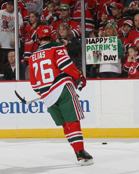
Notice how I said they'd never wear a new look. On March 17, 2010, the Devils broke out modern interpretations (meaning fitted to a Reebok template) of their classic red and green jerseys for St. Patrick's Day. They've worn them once a year on or near St. Paddy's Day in the years since.
For team that's been around 32 years, the Devil have a firmly established look. The colors are solid. The logo is timeless. The uniforms are clean.
They have zero reason to change and good for them resisting it in this case. And for that reason, they are my number 1.